NFT Platform
Where artists can create generative NFTs on their own custom smart contract without writing a single line of code.
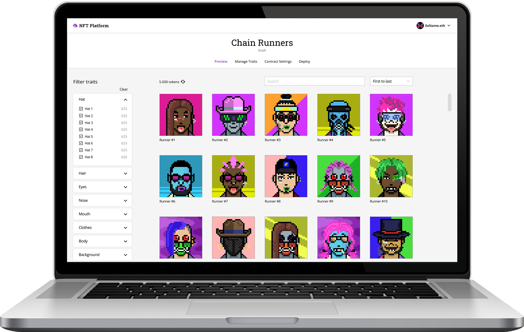
Project Overview
This solo project was part of a 10 week UX course at General Assembly, completed in March 2022.
My Role:
- Product Strategy
- User Research & Analysis
- Persona creation
- Wirefames
- Prototyping
- Usability Testing
- Visual Design
- Iterations
UX Techniques:
- Competitive Analysis
- User Interview
- Research & Analysis
- User Persona
- User Flows
- Sketching
- Wireframing
- Prototyping
- Usability Testing
- Iterating
Tools:
- Pen & paper
- Figma & Figjam
- Photoshop
- Illustrator
- Excel
- Maze
- Trello
Initial Assumption:
There are a lot of artists who want to launch an NFT collection, but can't find a developer who can help them encode the art onto the block chain by creating a smart contract.
In this case study I will test my assumption through the design process I laid out below.
Design Process
Design Thinking
The development process of NFT Platform was shaped by the principles of the design thinking methodology. It helped me keep a solution- and action-focused mindset within every design phase.
My general design process is determined by taking all factors of each project into consideration, such as project goals, business needs, complexity of the problem, time, resources, etc. For this project, I determined the following steps necessary:
Empathize
User Research
To test my initial assumption, I defined my research goals and interviewed four digital artists who either have been part of a launched NFT collection, or want to launch of their own. I recruited them by posting in various Discord communities.
Research Goals:
- To discover the challenges that artists face when creating their own NFT collection
- Understand their motivations and fears
- Identify their needs and what they wish to do
- Understand their process and see if they have used any other services already
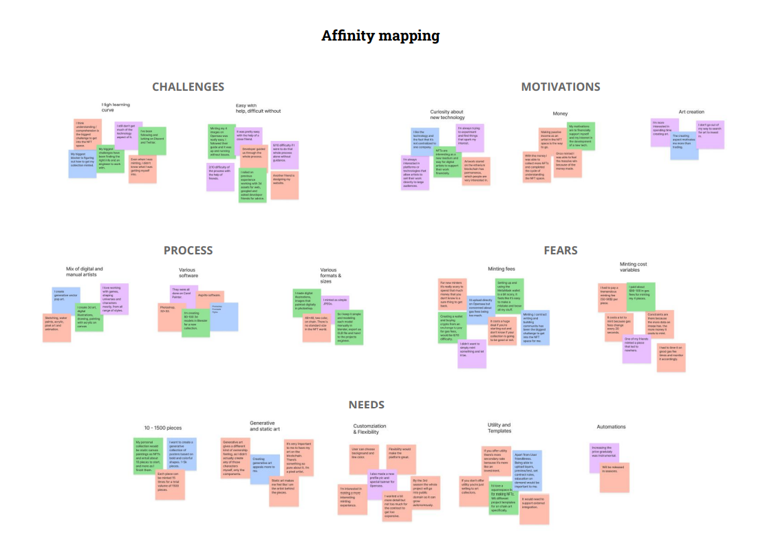
I found patterns in my research and grouped them together in this affinity map.
Competitors & Feature Analysis
After gathering data from the interviews, I also looked at current competitors in order to define the basic features of NFT platform. I only found a few that havent launched yet, and one competitor, whose features did not encapsulate all the desired ones either.
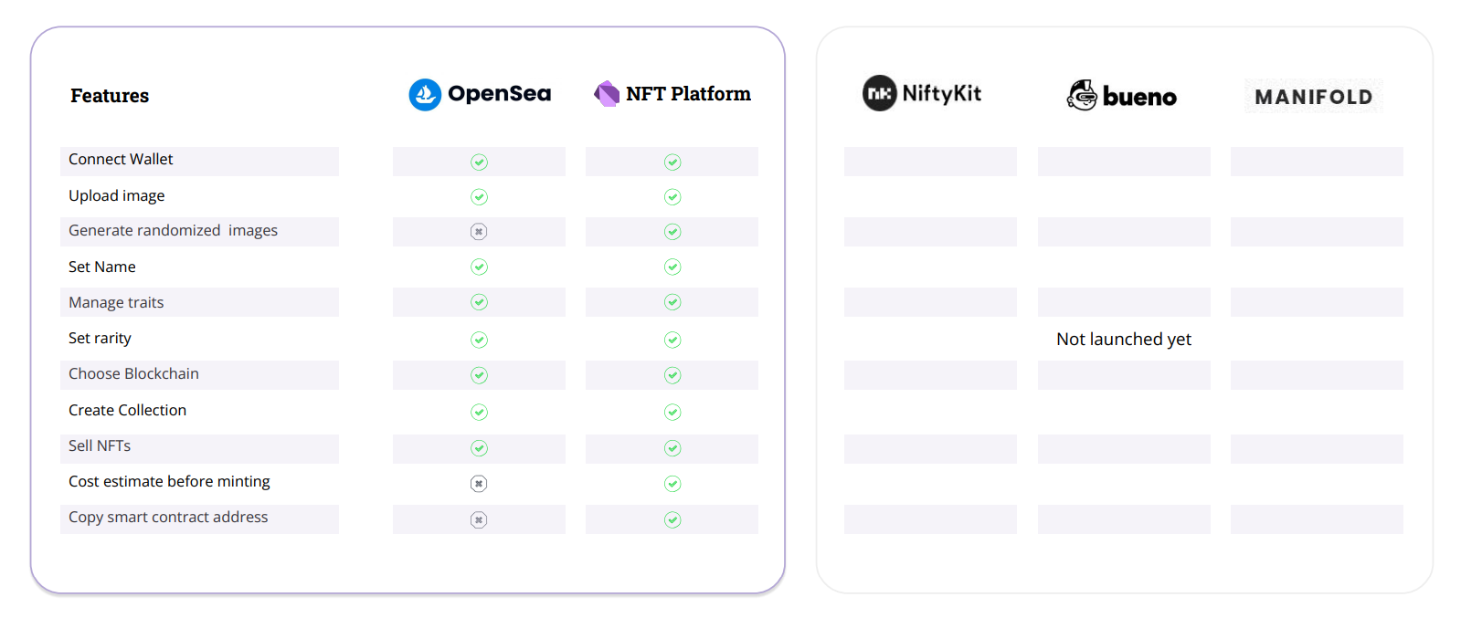
Key Takeaways
1.
There are no established services out there yet that have all the features necessary. However, there are some that are being prepared to launch.
2.
Everybody who has launched an NFT collection was lucky to have that one developer friend. Everybody else doesn't know where to even start.
"9/10 difficulty if I were to do that whole process alone without any guidance"
- Interviewee
Personas
Synthesizing the research enabled me to create this persona named Toby.
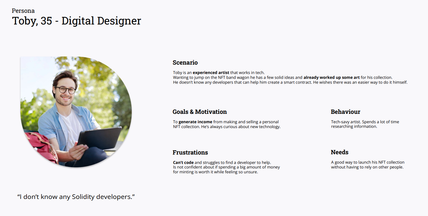
Understanding the potential users and validating my initial assumption through research let me define the following:
Problem Statement
Artists need an easy way to create, manage and deploy smart contracts because they find it difficult to find developers.
Hypothesis
We believe that by creating a simple to use platform and making it easy for artists to upload their art collection onto the blockchain, selling NFT artwork will become more accessible to artists all over the world.
How Might We...
... create a platform that enables artists like Toby to create and manage their own smart contracts without writing a single line of code?
Ideation
Feature Prioritization
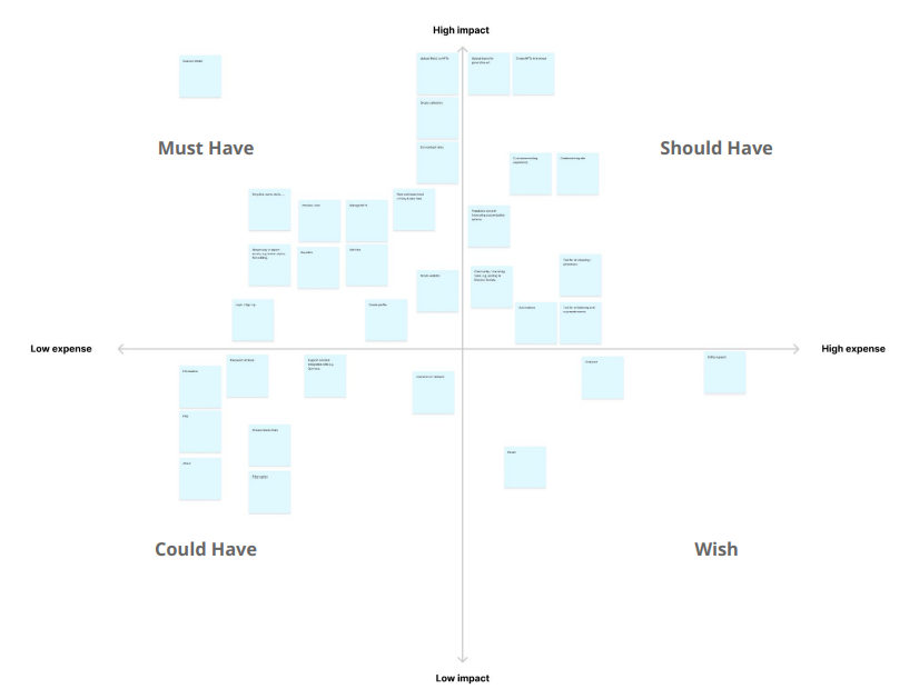
Moving into the ideation phase, I prioritized the desired features using the MoSCoW method. With the intention to design from the smallest scale up, building this matrix helped determine what features the MVP should have.
User Flow
Taking Toby's persona needs and goals into consideration, I compiled them into a user flow to map out the steps a user will take to complete their goal in the most efficient manner aka. the happy path.

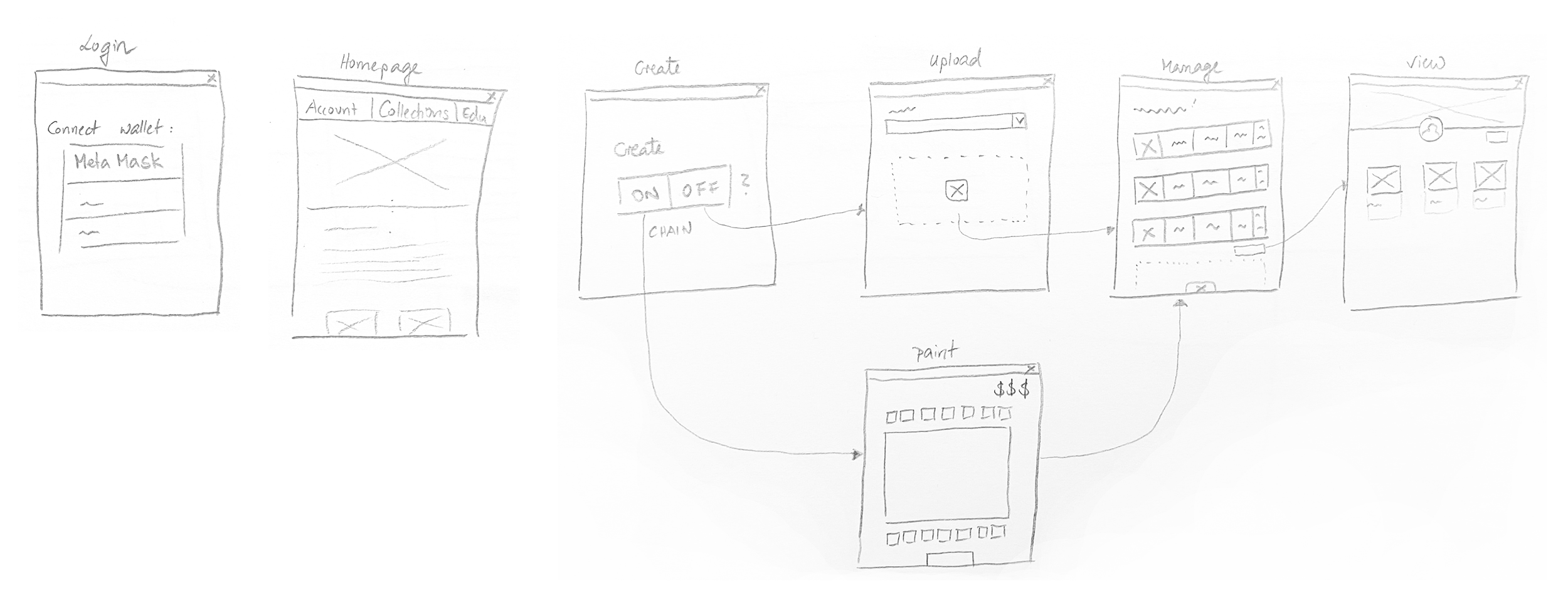
Sketching
I began sketching the main screens of the mobile view, using the user flow as a guide. This allowed me to quiclky explore different ideas for the layout.
Wireframes, Prototype & Testing
Wireframes, Prototype & Testing
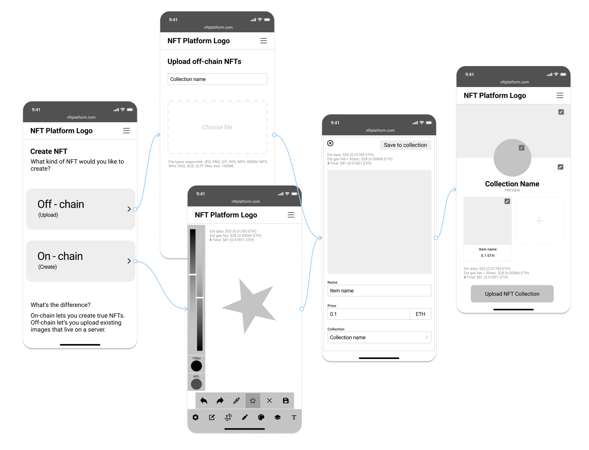
The sketches were turned into wireframes and a mid fidelity prototype, ready for testing. I asked three remote testers to complete two tasks:
- Task 1: Upload an existing file on your phone as an NFT to a collection
- Task 2: Create a star and upload it as an NFT to a collection
Key Takeaways
The tests revealed very insightful results:
- The terminology is confusing and (even) inaccurate
- We do not want to compete with already established software and create our own MS paint
- Nobody would actually want to use this on mobile!
Action points
Actions to improve the product in the next iteration:
- Conduct research and clarify terminology, maybe add help text
- Accept that artists want to rely on established software to create their art, and rework the feature prioritization and user flow
- Move away from mobile and see if desktop makes more sense
Iteration 1
Revisit & Revise
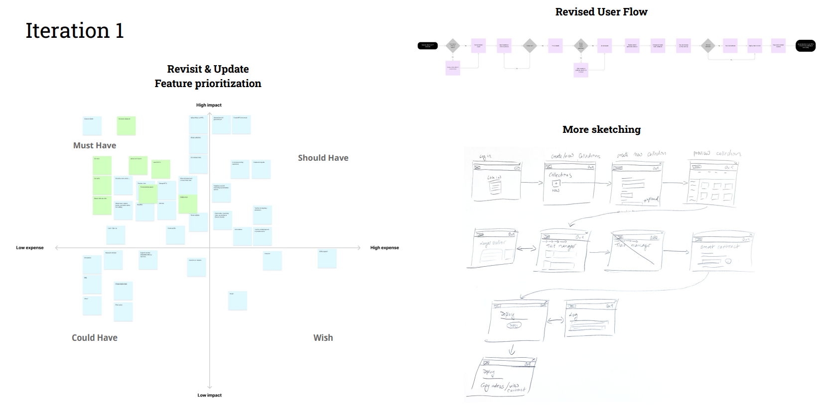
So I went back, did some more research, revisited and updated my prioritization, created a new user flow and sketches for the iteration.
Wireframes, Prototype & Testing
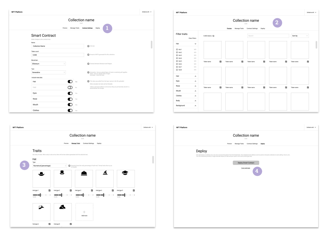
This time, through two moderated and three unmoderated tests, I requested the testers to complete the following task:
- Log in to the platform and create a new smart contract
- Upload some assets and manage attributes and contract settings
- Deploy contract and retrieve smart contract address
Key Takeaways
The takeaways from this user test were:
- All but one tester completed the task successfully with a less than 10% misclick rate
- Both moderated testers spontaneously said they would use this platform immediately
- Some terminology is still confusing
- One concern was about 'making expensive mistakes'
The last two points will need to be addressed in more rounds of iteration and testing.
Refine
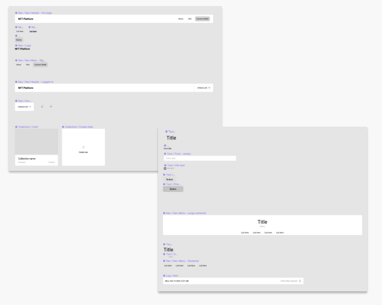
Components & Pattern Library
Here's some insights into the components and pattern libraries I created while making the prototypes.
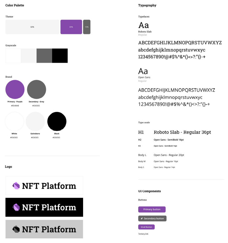
Styleguide
Here is a styleguide defining things like colors and typography.
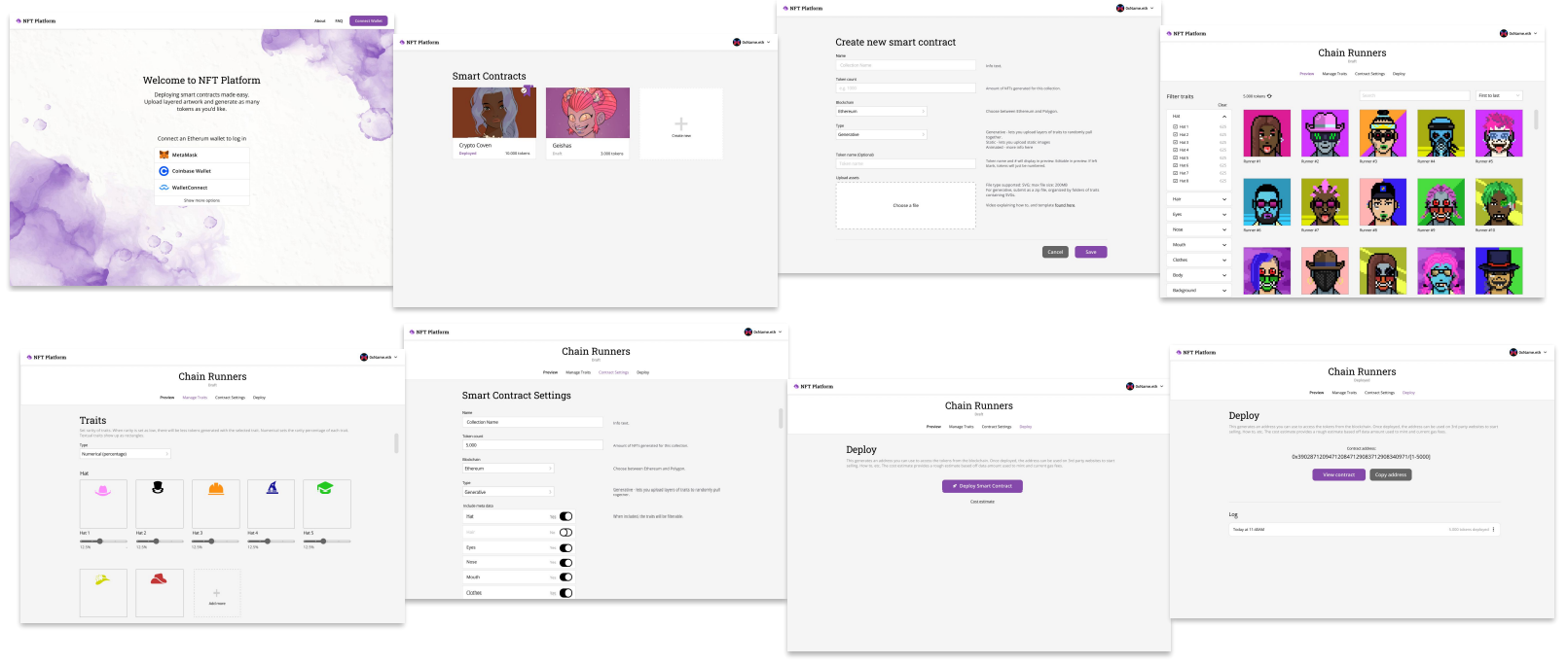
High Fidelity Wireframes
They turn the mid fidelity wireframes to high fidelity ones.
Next Steps
Future Features
- Multiple rounds of refining & retesting
- Work closely with solidity developer to ensure feasibility of the product
- Determine placement of certain features through A/B testing
- Produce How-to video tutorials
- Add 'Rules' to enable fine tuning of trait combinations
- Refine rarity sliders & cost estimates
Retrospective
Learnings
Working on this case study has been an incredibly enjoyable experience for me. As someone who had been curious about web3, I deeply appreciated the opportunity to dive into this topic and create this project.
One significant aspect I observed during this process was the difference between working on a project independently from scratch versus collaborating with developers and stakeholders in real-life scenarios. While the course project allowed me to take complete ownership, I recognize the importance of consulting and involving relevant stakeholders in real-world projects to ensure comprehensive perspectives and successful outcomes.
One of the key takeaways from this case study is the paramount importance of research and testing in creating a truly user-centered product. Through conducting thorough research and implementing testing methodologies, I gained a deeper understanding of how essential it is to consider user needs, preferences, and behaviors throughout the design process. This experience reinforced the significance of incorporating user feedback to refine and enhance the user experience.
Overall, this case study has been an enriching learning opportunity that has broadened my understanding of web3 and emphasized the value of research and testing in creating user-centered products. I am excited to apply these learnings to future projects and continue my growth as a UX designer.